PureFuel

★★★★★

Industry

Health, Wellness, Fitness, Nutrition

Deliverables

Logo, Brand Guidelines

Time of Delivery

7 days

The project description

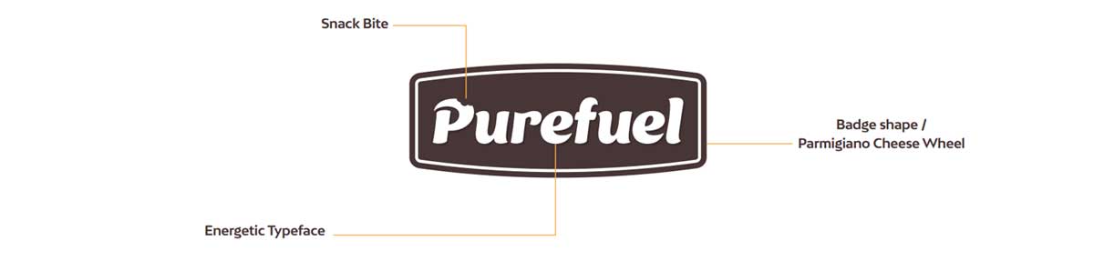
PureFuel is a health-focused snack brand providing natural, minimally processed products. The project aimed to create a brand identity that reflects PureFuel’s commitment to simple, wholesome ingredients.

The brand identity focused on:

  • Logo Design: A badge shape for trustworthiness, with a cursive script and a “bite” mark to emphasize natural snacks.
  • Color Palette: Earth tones like turquoise and lime green to evoke health and freshness.
  • Typography: Ice Cream and BW Mitga for a clean, approachable feel.
  • Visual Elements: A cheese wheel shape in the logo to represent the flagship product, Parm Crisps.

The thinking process behind the concept

  • In the process of building PureFuel's logo, we opted for a simple, clean badge shape to convey trustworthiness and quality.
  • The rounded edges add a friendly, approachable feel, and it also represents a Parmigiano cheese wheel.
  • The cursive script for "PureFuel" was chosen to suggest fluidity and naturalness, reflecting the purity of the products.
  • We incorporated a small bite in the letter "P" to visually connect to the snack product line​